I recently decided to focus on web development. Towards that end, I ambitiously began learning React. React led to vanilla Javascript, and vanilla Javascript led to HTML/CSS, and now I have a portfolio page for all my recent web projects.
The projects I built are based on the Responsive Web Design course at Free Code Camp. I started learning there ages ago, but after I started my real-life bootcamp in August 2016, I took a hard detour into iOS.
I never finished my Responsive Web Design certificate because I was too busy studying other things. With my apprenticeship finished and wanting to learn modern web development, I decided to tie up loose ends. Free Code Camp had added new curriculum since I had last visited, including the projects below.
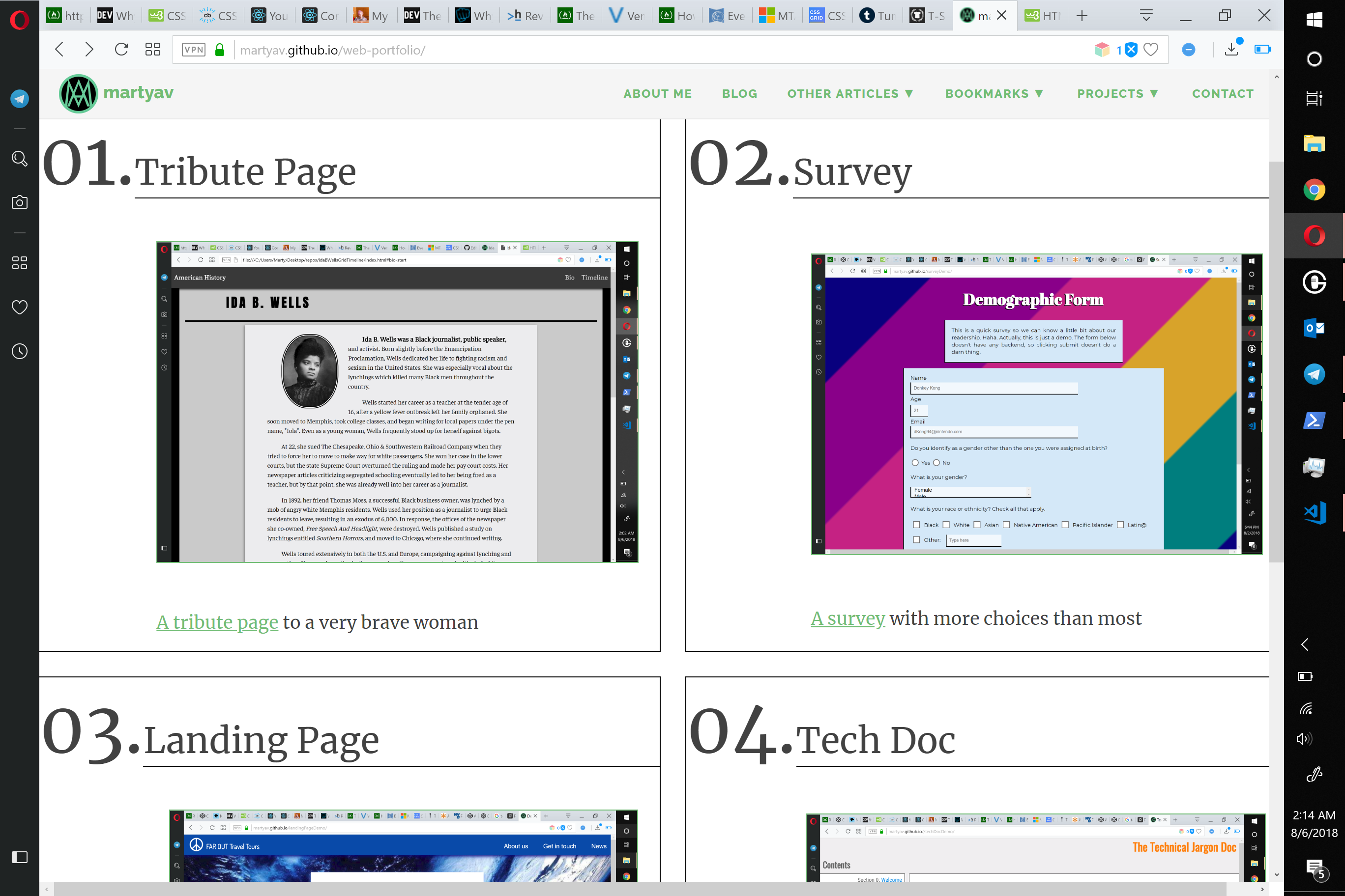
Tribute
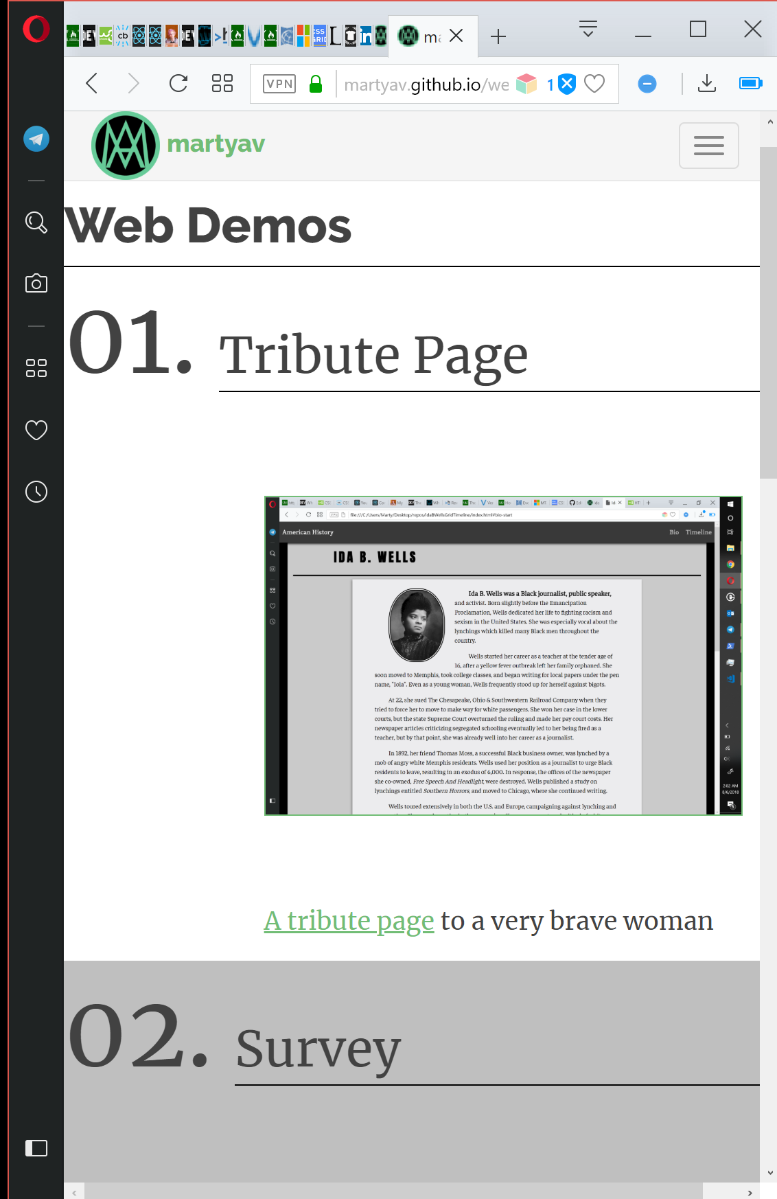
First up is a tribute page.
Back in 2016, when I started at Free Code Camp, I had made one for Wendy Carlos, but since I was and am learning new web technologies, such as CSS grid, I decided to practice on a fresh project.
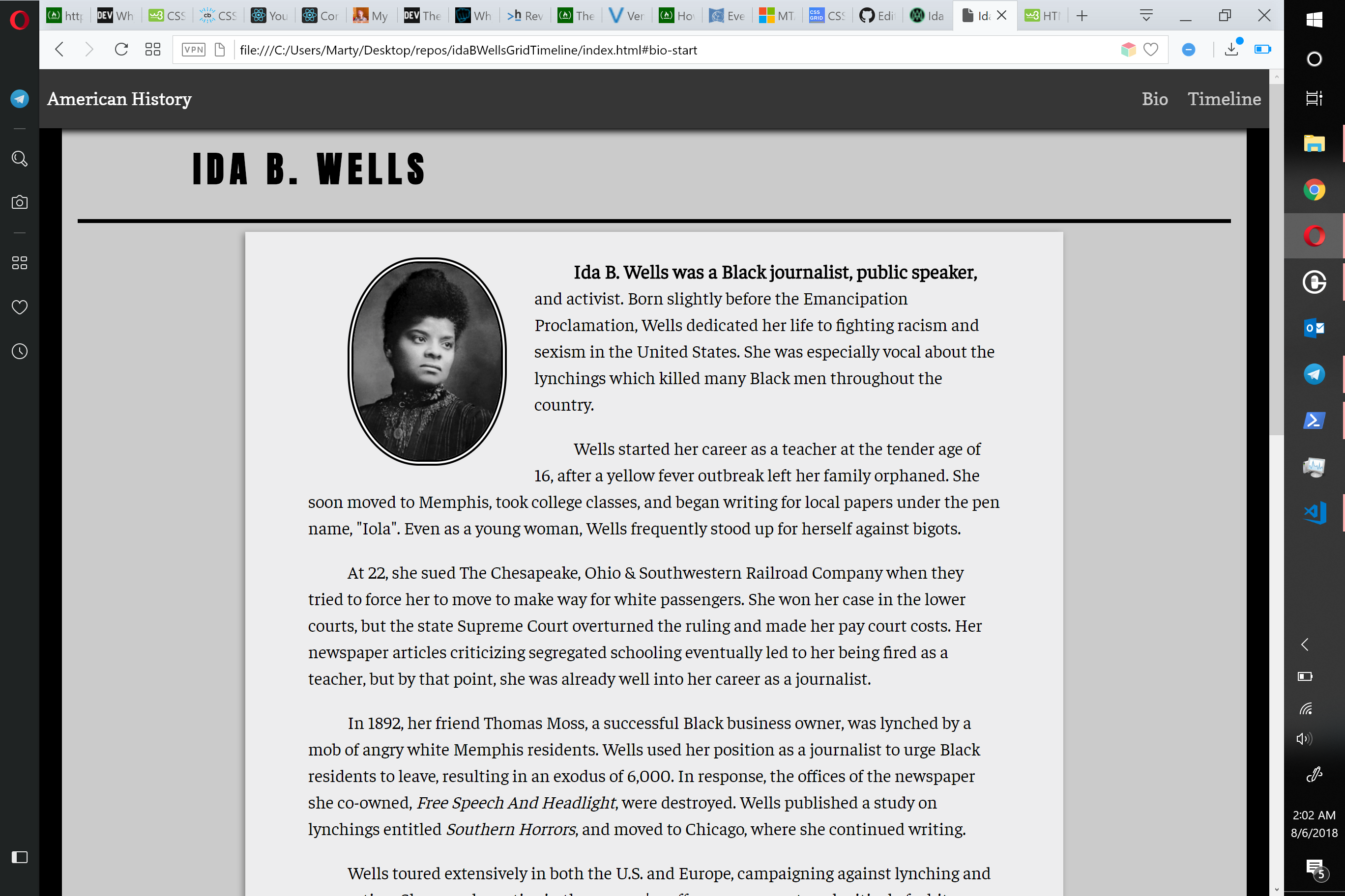
My girlfriend Margaret suggested I do a tribute to Ida B. Wells, a woman I had only vaguely heard of up to that point. I knew about her from social media posts about the suffrage march, but I honestly had no idea how active she was in resisting lynch law and Jim Crow throughout her life, or how important she was to Chicago.
Learning about her life was very interesting, but I couldn’t take the same attention to detail on the content for all of my projects. Afterall, I was practicing web design, not writing. Although I did focus heavily on the written content here, I also gave myself the challenge of aligning the timeline dates and descriptions using CSS grid; it was my first attempt using this extensively.
As for visual style, since Wells was herself a journalist, I took design inspiration from print journalism. The colors are muted, the first line of every paragraph is indented, and the bio ends on a fleuron, a leaf-shaped printer’s ornament that has traditionally been used to indicate the end of an article or section.
Survey
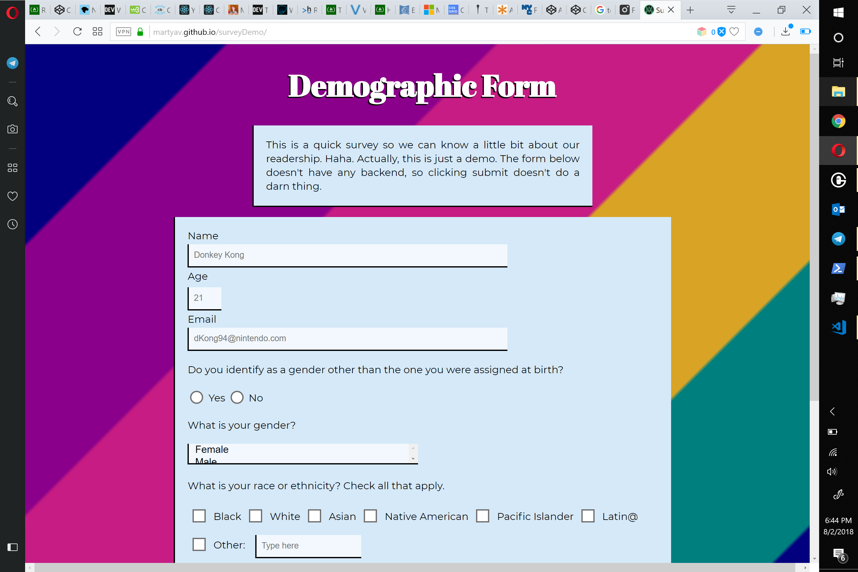
The second project is a survey page. Out of all the web projects, this one felt the most familiar: I’ve made more than a few iOS log-in screens, input forms, and search bars.
In iOS, survey and form screens make use of textfield elements which are rather more layered than what we have in HTML/CSS. I mean that literally–if you want to work on the borders of a textfield, for example, you have to either drop down to the graphic layers making up the textfield, or add a separate image element emulating a CSS-style border. Thankfully, the web API for styling input fields is much more easy to work with.
The main challenge here was figuring out how to add write-in options with as little Javascript as possible. Surveys that don’t include write-ins for race and gender are a pet peeve.
This one also made use of a background of linear gradient stripes, a favorite trick of mine back when I was working on blogs and forum themes. I went with highly satuarated, slightly darkened rainbow stripes to help convey demographic diversity, and to make the form a bit more interesting to look at. The underline on the text inputs came from an old hackathon project.
Landing Page
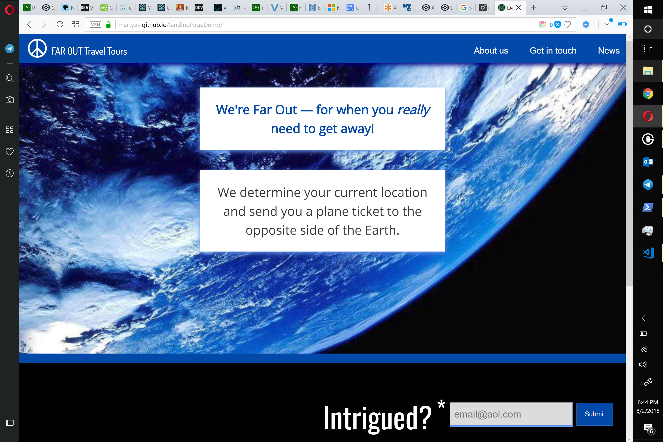
The third project is a landing page for a fake product. This one took the longest, since I had a hard time coming up with a good product concept. In the end, I went with a travel agency that sends customers to the ends of the Earth.
The styling for this was more complex than any of my previous web projects, because I wanted to have clear divisions throughout the entire page, and make it look really current. In fact, this is the one project in my repo that is primarily CSS.
The user story for Free Code Camp’s version calls for a video, but I altered the one hosted on this site to not have video, because I was having a hard time finding appropriate material, resizing the div, and it just didn’t work very well with the content on the rest of the page. Now, if someone was paying me to add video, I would make it work, but as a portfolio piece, video just didn’t fit.
I used my codecamp’s own landing page for initial inspiration, then followed the Earth/space theme when it came to colors, fonts, and additional styling. In particular, the paragraphs over the Earth image have a dim blue box-shadow, emulating earthshine.
Tech Doc
The final web demo was definitely the fastest, from start to finish. It’s a simple tech doc. The one trick here was making the side menu fixed, and ensuring that the site looked good at all screen sizes.
Free Code Camp’s user stories called for a lot of text within the doc, to style code and lists, but I didn’t want to spend a ton of time trying to come up with a good concept, so I used standard lorem ipsum filler text with some tech terms sprinkled in.
I threw upon StackOverflow, OneSpace, Wikipedia, and the many programming textbooks I’ve been reading for visual style.
Portfolio
After I had these four projects finished for Free Code Camp’s Responsive Web Design certificate, my last challenge was creating a portfolio page according to Free Code Camp’s specs. I made a demo on CodePen, but since I already have a perfectly good website right here, I made the effort to import the content and grid styling to martyav.github.io.
The hardest part about this project was making the grid responsive. The second hardest was figuring out how to implement my site theme while retaining the custom styling I had worked so hard on. In the end, combining Jekyll wth the custom CSS really wasn’t too bad…it was just puzzling out how to make it happen that was the rough part. Turns out that you can just drop in an internal style sheet right alongside the HTML and Markdown syntax!
Well, that’s it for now. I’m going to go back to learning React and Javascript, while making use of all I’ve learned about web design. Hopefully, I’ll be pounding out fully interactive web pages in no time.